The one letter that turned Instagram's new logo into a joke
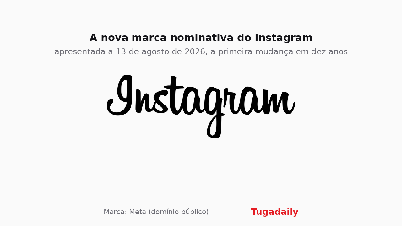
Adam Mosseri unveiled the first change to Instagram's written logo in ten years on 13 August. The script stays, the serifs are flattened and detached, the app icon is untouched, and the internet has decided it now reads as Instagzam.
Instagram has changed its written logo for the first time since 2016. Head of app Adam Mosseri announced it on 13 August across the official Instagram and Threads accounts, and it is reaching phones worldwide over the following days.
What changed is subtle and, once you have seen it, impossible to unsee. The script survived, because it is the part anyone recognises from across a room. But the stroke is more compact and heavier, the serifs have been flattened and pulled away from their neighbouring letters, and the s, r and g have all gained rounder curves. The colourful home-screen icon is untouched. The gradient everyone associates with the brand will appear more sparingly from here.
This is not only a logo. Meta introduced a system built on three type families, Instagram Sans, Instagram Pen and Instagram Mono, rolling out through 2026 and beyond. The wordmark is simply the first piece out of the door.
The letter that spoiled it
Then there is the reception. Within hours, Reddit, X and Threads itself had converged on the same verdict: the r now closes so tightly against the g that plenty of people read the word as Instagzam at a glance. The nickname stuck, and it has not let go.
None of that is unusual. Redesigns of marks this recognisable more or less guarantee a week of mockery, and most of them survive it. The interesting detail is that the complaint is not about taste, it is about legibility, which is exactly the ground a typographic redesign should not be losing on.
Why now
Jasmine Probst, Instagram’s director of product design, defended keeping the script by arguing that handwriting reflects individuality, and that referencing it made sense for an app built around personal creativity. The design team wrote on its own account that it explored hundreds of directions before landing on something fresh and simple.
For users in Portugal nothing functional changes. What changes is the mark sitting above the feed, and the assets that businesses and creators reuse in their own material. Anyone working with the platform will want to refresh the files they have saved, particularly after YouTube’s new monetisation thresholds reminded everyone how quickly platforms move the goalposts. Approved files and usage rules live in Instagram’s brand resource centre at Meta.
By Oliver Grant
Image: Meta wordmark (public domain) · montage Tugadaily